In fall 2022, I was tasked with designing a personal logo for an Arts student through a mock client process. This project challenged me to distill a person’s evolving identity, values, and aspirations into a single, versatile visual logo. With only one client pitch and a brief five-minute interview, I listened intently, interpreted subtle cues, and translated them into a design that authentically captured the student’s character and creative journey. The result was a meaningful logo grounded in personal symbolism and long-term relevance—timeless and adaptable.
The following list is a brief overview of my two-week client logo
design process from the
initial interview to the final approval:
• Client Interview
• Moodboard Creation
• Sketches
• Adobe Illustrator Iterations &
Mockup Creation
• Final Approval
The client provided me a paper description of themselves and I was alotted 5-minutes to interview the client for additional details.
• What are your key personality traits?
• What
hobbies or pastimes do you enjoy most?
• What books, TV
shows, or movies resonate deeply with you?
• What are
your long-term aspirations in life?
• What styles or
eras of logos resonate with you?
I created a moodboard using internet-sourced images to reflect the client’s core values—independence, observance, and determination—as well as his interests in Japanese TV shows, strength training, and cryptocurrency. To maintain consistency and relevancy, I recorded design rationales under each moodboard image.
Figure 1: Icon Moodboard
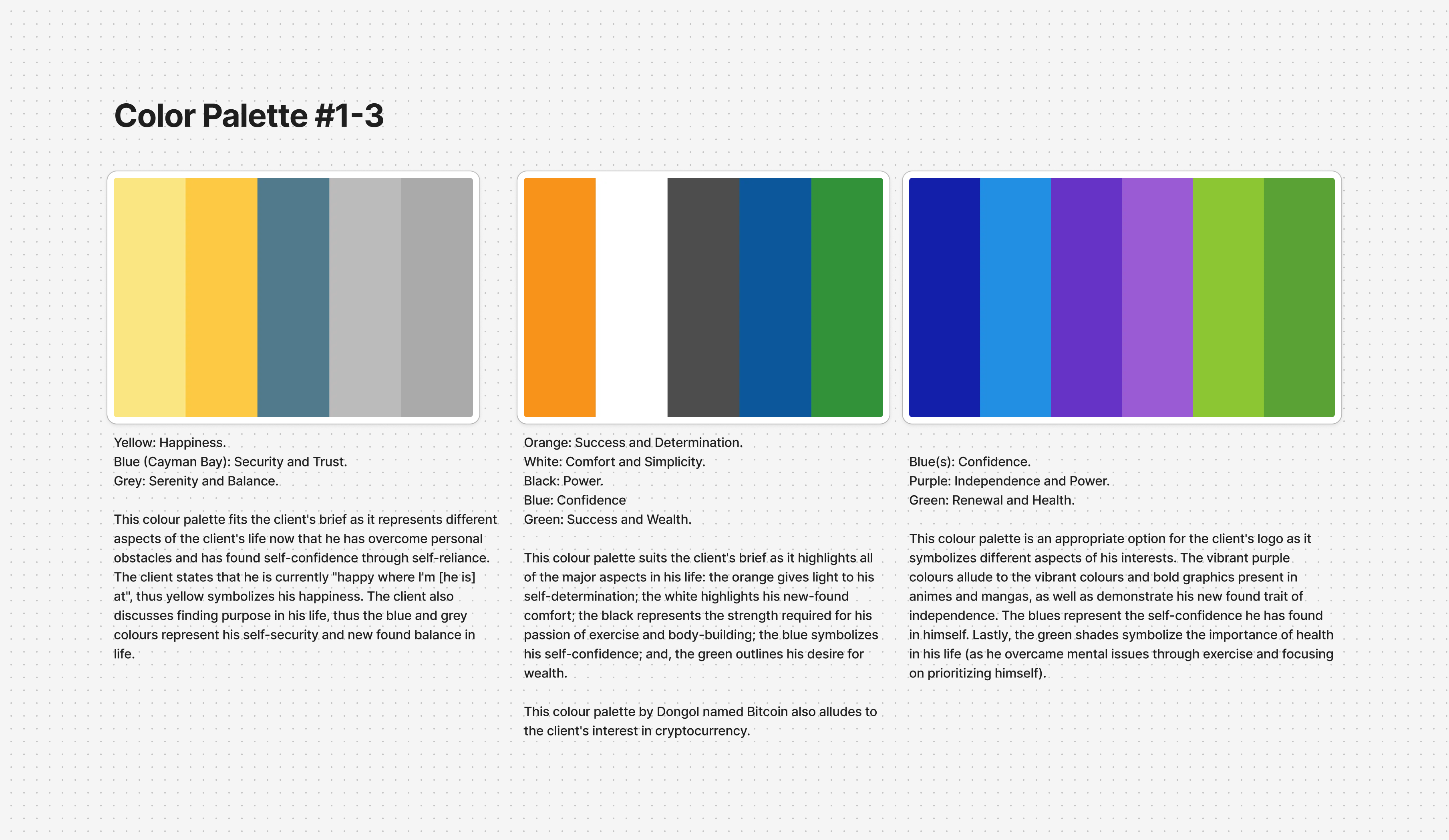
Figure 2: Color Palette Moodboard
After identifying recurring symbols, I sketched multiple iterations and merged them into one cohesive, layered design. The final logo featured the silhouettes of an eye and a fist, styled after a contemporary, minimalist cryptocurrency logo with sharp geometric forms and cool-toned gradients. The eye represented both the value of observance and a recurring motif from his favorite Japanese show, while the fist symbolized his commitment to strength training, perseverance, and self-reliance.
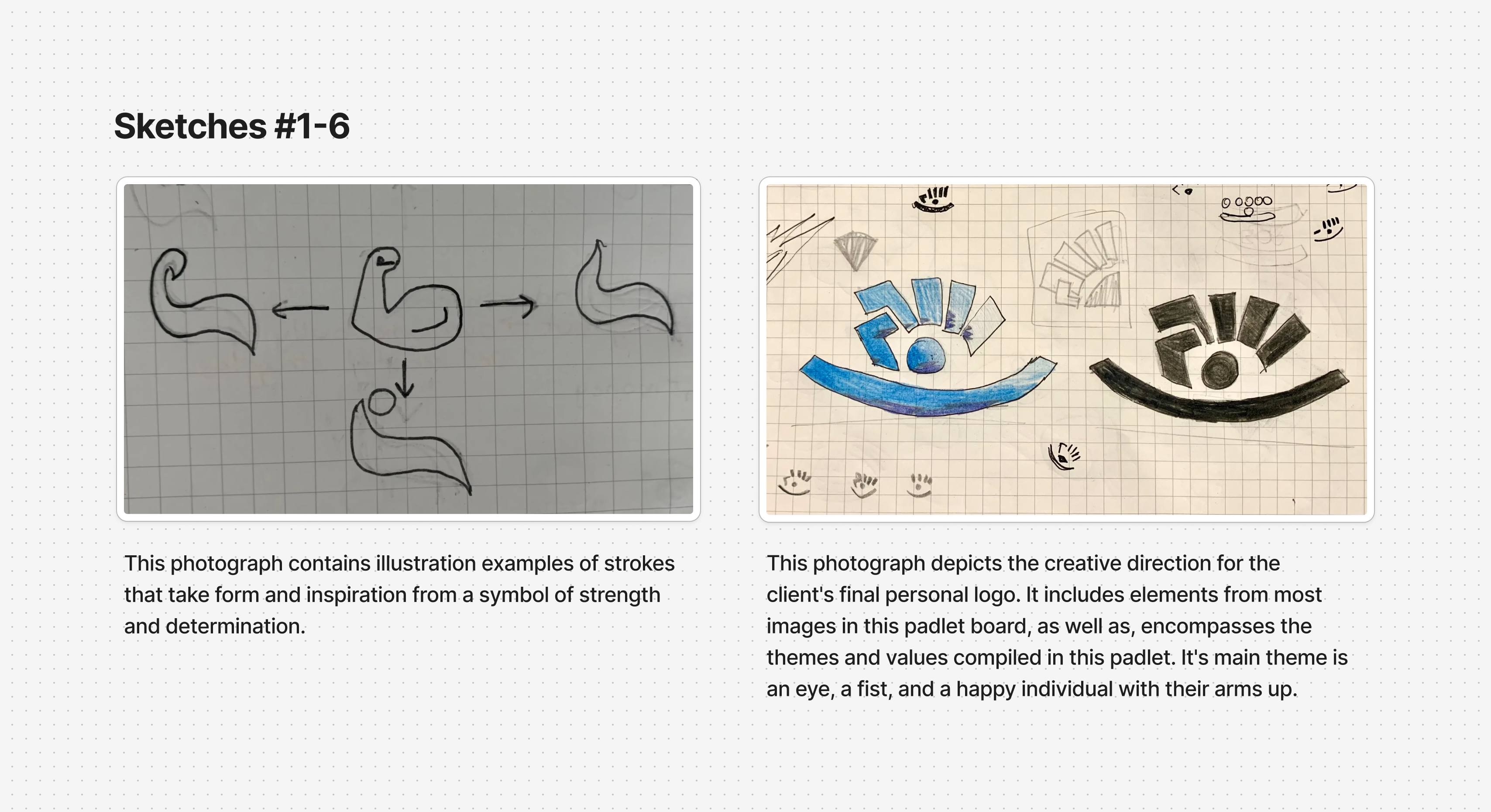
Figure 3: Select Sketch Iterations
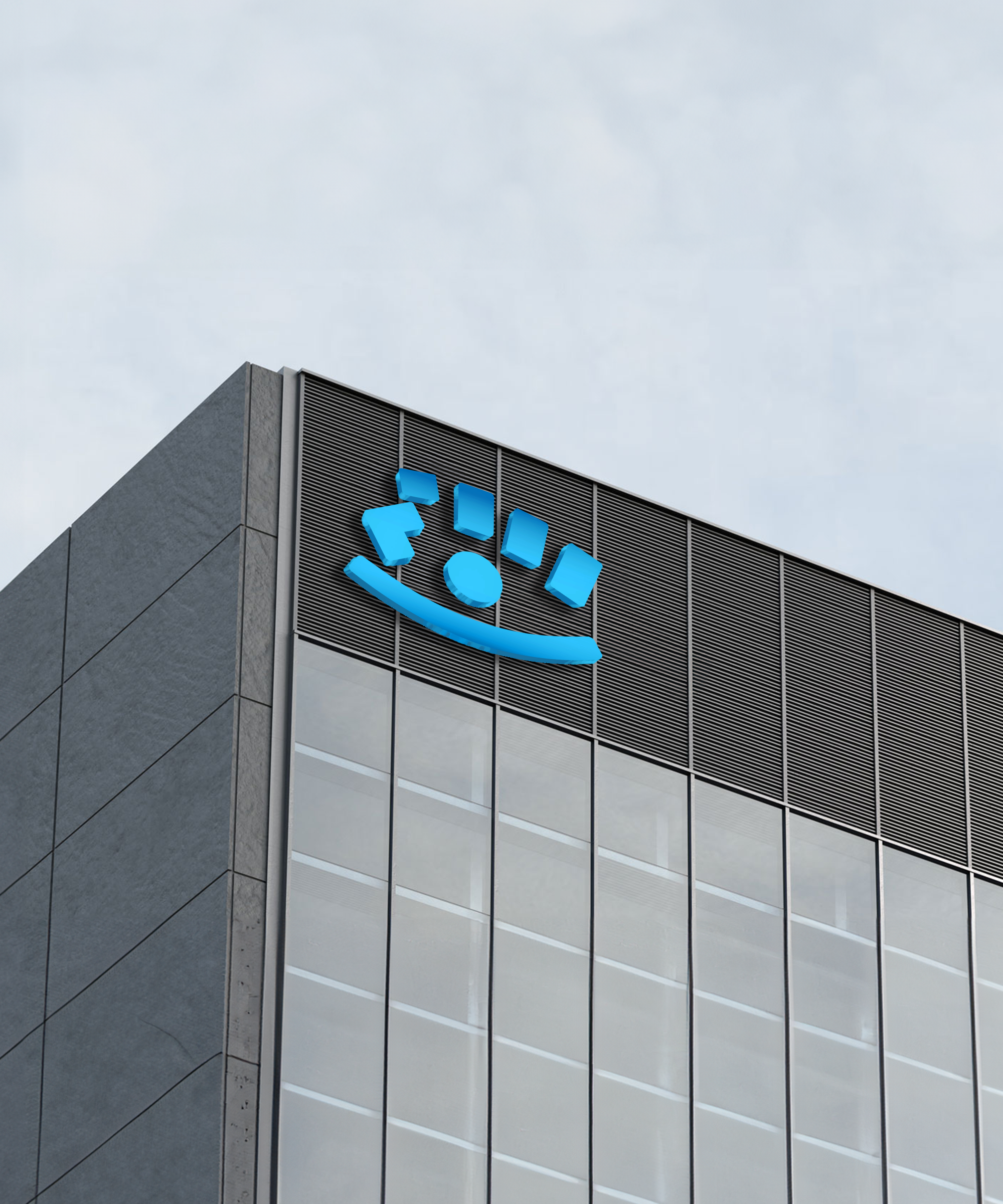
To veryify the logo’s scalability and communicate its full potential, I developed mockups across real-world applications. Each showcases how the design maintains impact, symbolic clarity, and brand presence across formats.
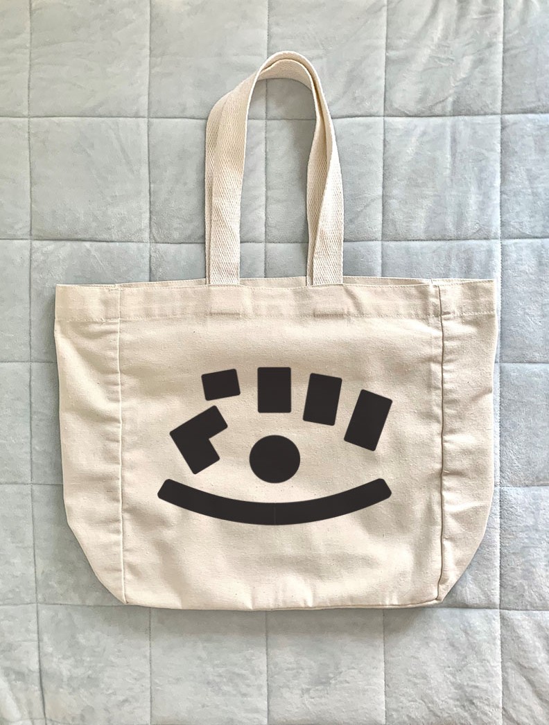
Figure 4: Tote Bag Mockup

Figure 6: Building Logo Mockup
This project deepened my understanding of how to translate personality and values into visual identity. The final logo was well-received by the client—who appreciated the color palette and felt personally represented in the design.
What worked was drawing inspiration beyond internet-sources icons, but photographs and symbols in everyday life. For future logo projects, I would explore more alternative color schemes to offer greater versatility, and focus on embedding symbolism that operates on a deeper conceptual level rather than relying on more literal visual references.
Overall, the mock client process reinforced the value of thoughtful symbolism and client-centered design direction.
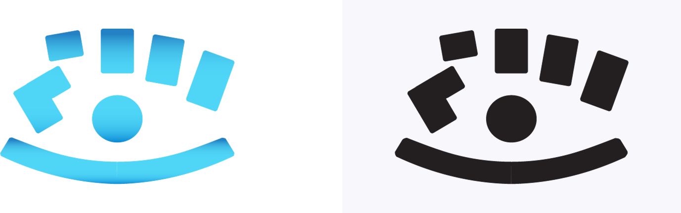
Figure 7: Final Iterations