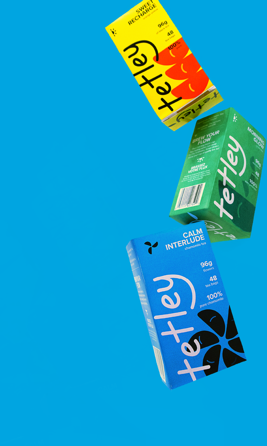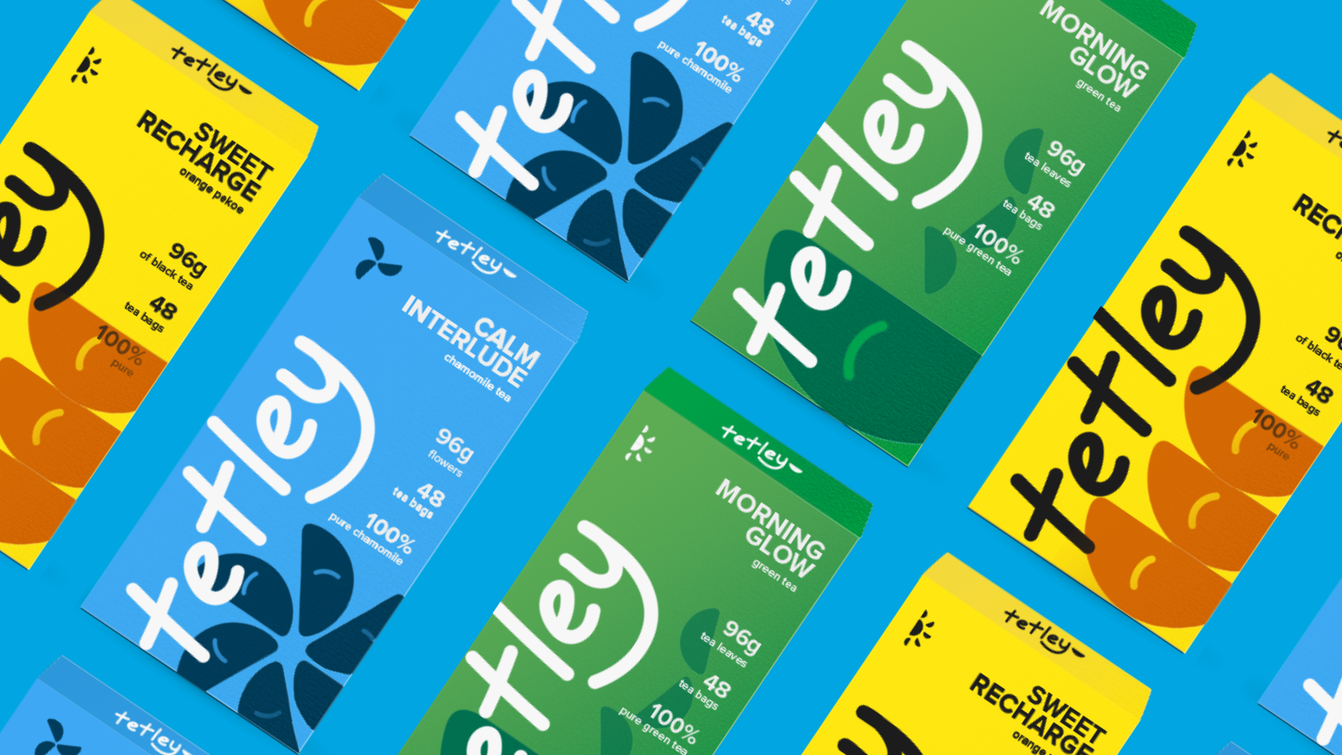
I led the end-to-end redesign of Tetley through a refreshed marketing campaign, Fuel Your Flow—a lifestyle-forward rebrand centered on wellness and energy.
As part of a comprehensive two-month course project, I redesigned product packaging, refined the brand tone, and created social campaign visuals. Through in-person competitor research, shelf audits, and market trend analysis, I identified gaps in market appeal and opportunities to modernize Tetley’s visual identity while preserving its roots.
Tetley, a popular english tea brand since 1837, has built trust through tradition, but with rising competition from youth positioned brands like DAVIDsTEA and Starbucks, Tetley's brand is facing a barrier connecting with younger audiences—losing its competitiveness, market share, and shelf space. A brand refresh and marketing campaign are required to help Tetley maintain its position as a key competitor in soft drinks industry.
Position Tetley as an aspirational, sustainable drink that resonates with a new generation of tea drinkers. Tea is no longer just for winding down—it's a tool for focus, energy, and self-improvement. "Fuel Your Flow" reframes tea as a daily ritual for empowerment.
The pitch deck below provides and overview of Tetly and focuses on market development through a strategic brand repositioning, expanding Tetley’s appeal to a younger consumer segment:
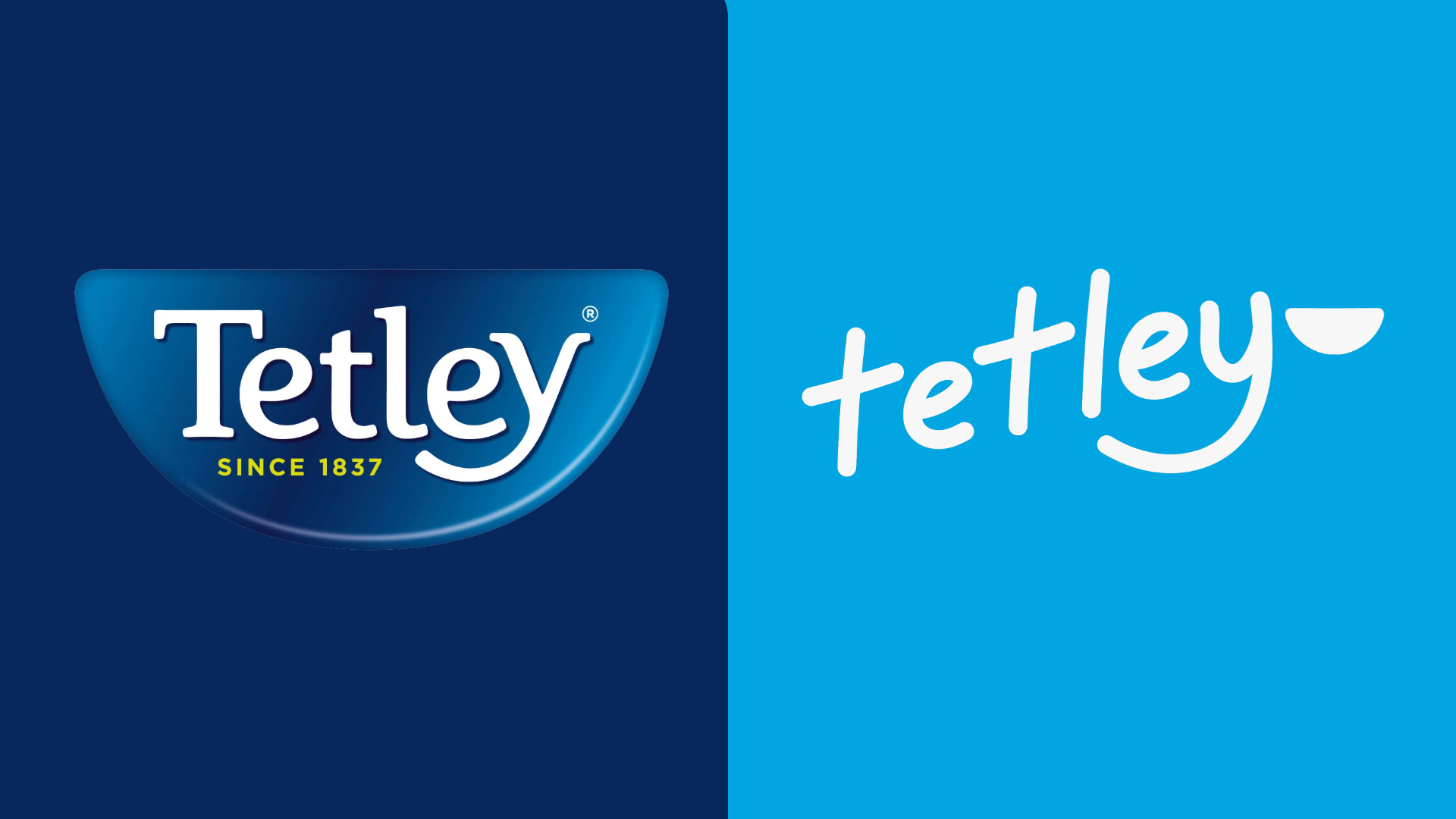
Figure 1: Tetley Pitch Deck
This rebrand positions Tetley as a bold, modern choice for a new generation of tea drinkers. By aligning the brand with youthful lifestyles, simplified packaging, and aspirational messaging, "Fuel Your Flow" reinvigorates Tetley’s identity while staying true to its roots in wellness and sustainability.
• Bold Redesign: Committing fully to bold brand colors and a
visually impactful logo designed to stand out on shelves for younger
markets
• In-Person Insight:
Visiting a range of stores—from convenience shops to
large grocery chains—provided firsthand perspective and allowed me
to self-evaluate through the perspective of a customer
• Breadth of Research: Reviewed data from many
sources, including consumer feedback, customer reviews,
influencer commentary, and tea vs. coffee market data to better
understand shifting preferences and identify challenges and
growth opportunities
• Refining Assets: Further research into typography, including
kerning and letter spacing, could create a more polished appearance
• Secondary Research: Including implementation steps and
competitor case studies with similar success in the pitch deck could
have strengthened the credibility of my design decisions