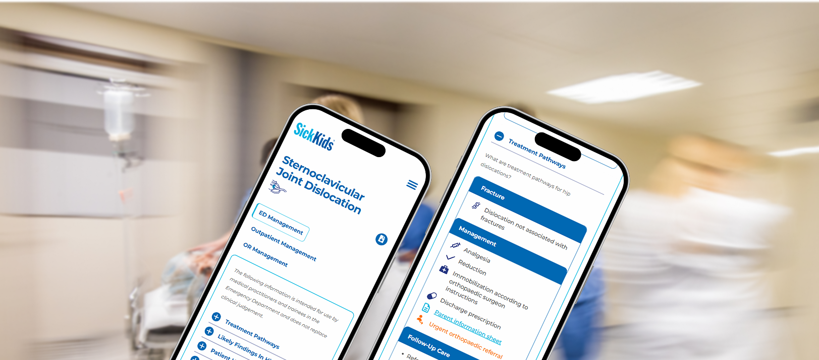
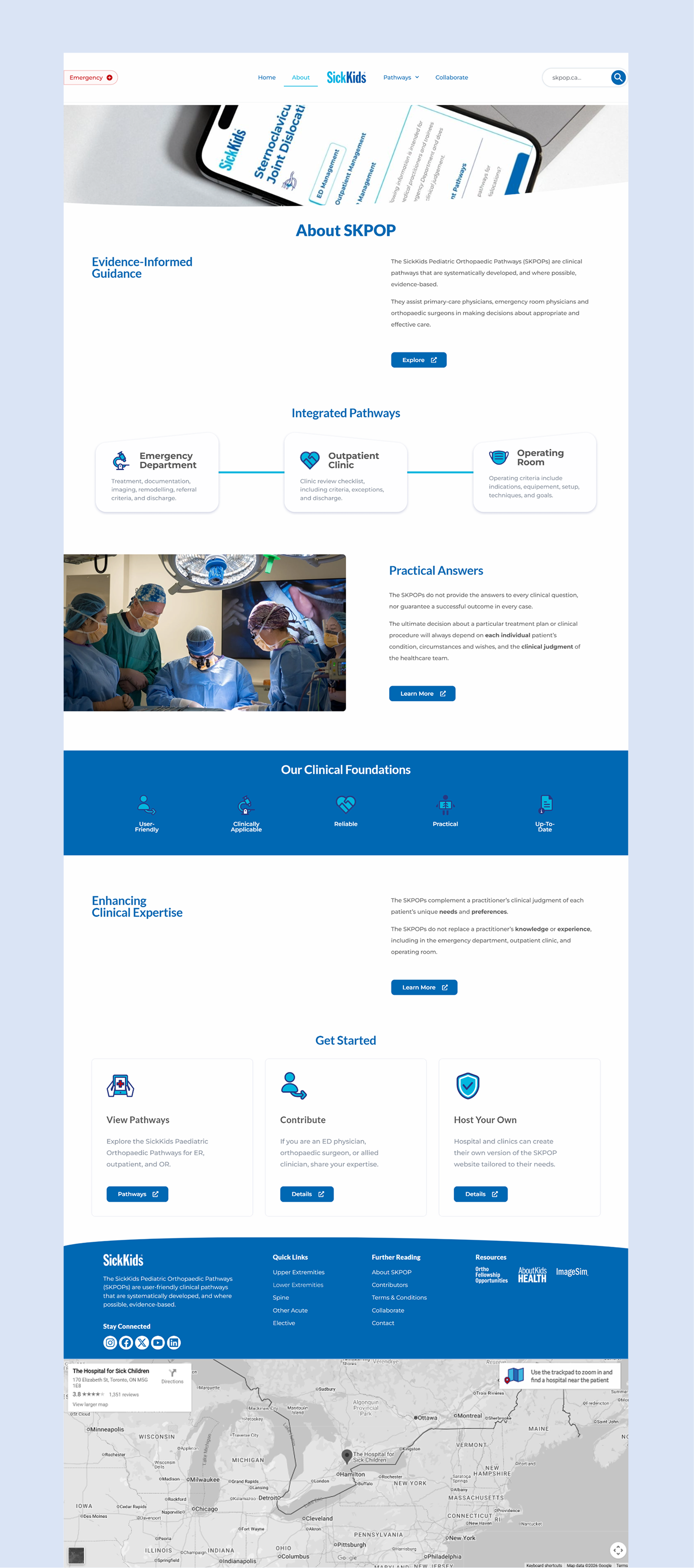
At the heart of The Hospital for Sick Children’s (SickKids), the world’s leading children’s hospital, 2030 Strategic Plan, is divisions partnering with designers and engineers to advance precision child healthcare. Their latest digital product—SickKids Paediatric Orthopaedic Pathways—is an all-in-one decision-support guide platform for physicians in live care settings.
I was hired to lead, design, and develop the website, translating written contributions from 10+ physicians into an external live site with SickKids branding in 16 weeks.
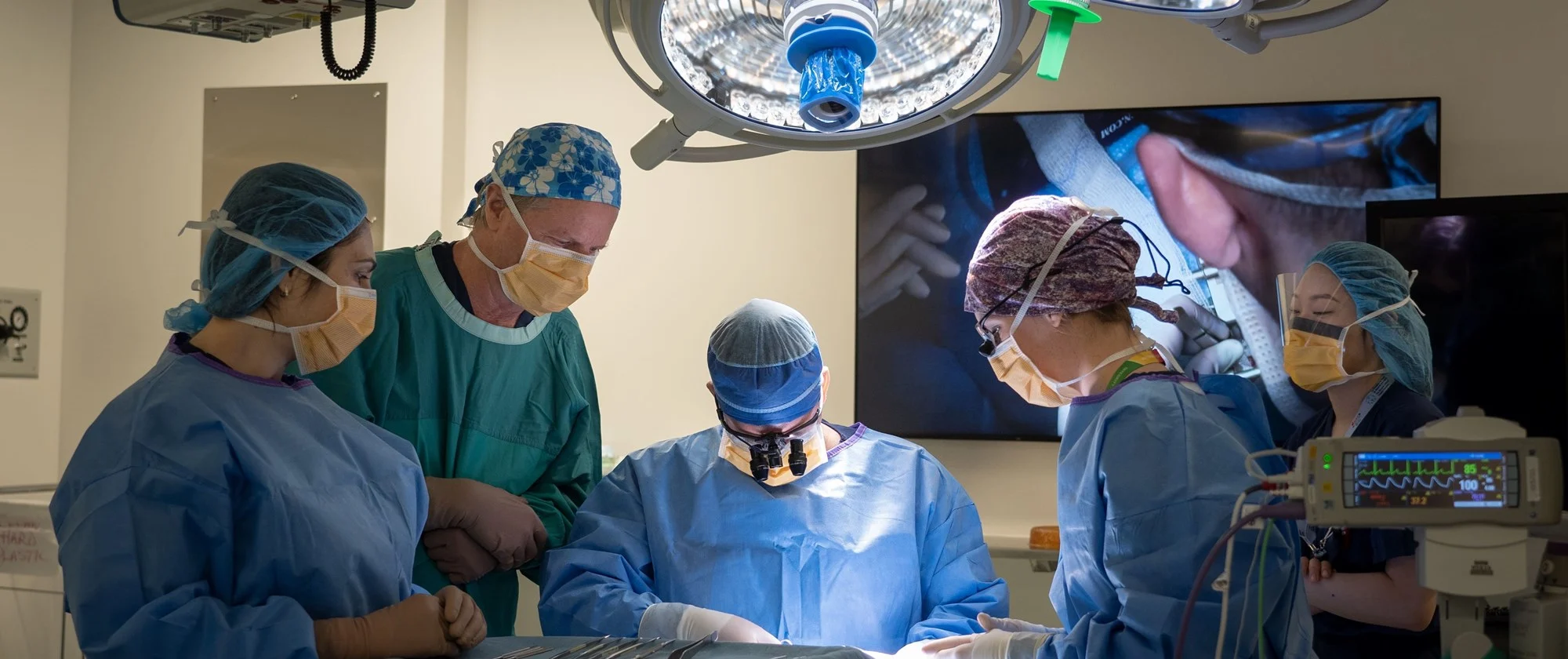
Despite strong clinical expertise, orthopaedic physicians across ER, clinic, and OR settings lack a shared, authoritative point-of-care resource. This leads to unnecessary referrals, repeated patient visits, and inefficient knowledge transfer between residents and experienced physicians.
“How might we design a centralized platform that replaces ad-hoc consultation with standardized clinical guidance for physicians.”
This platform needed to fit seamlessly into physician workflows across the ER, clinic, and OR in high-pressure environments. Existing solutions are global and do not account for Canadian-specific contexts. Designing this platform presented several key challenges:
1. Rapidly navigating complex clinical documentation
2. Learning and mastering WordPress and Elementor Pro
3. Coordinating independently with physicians
4. No design system provided, must analyze brand independently
5. Presenting UX design direction to align with stakeholders
5. Implementing an agile workflow to meet a tight 16-week
timeline
If successful, the projected results in my division include:
Reduce patient phone calls by:
Reduce patient revisits by:
Reduce unnecessary
redundant
patient
referrals across departments.
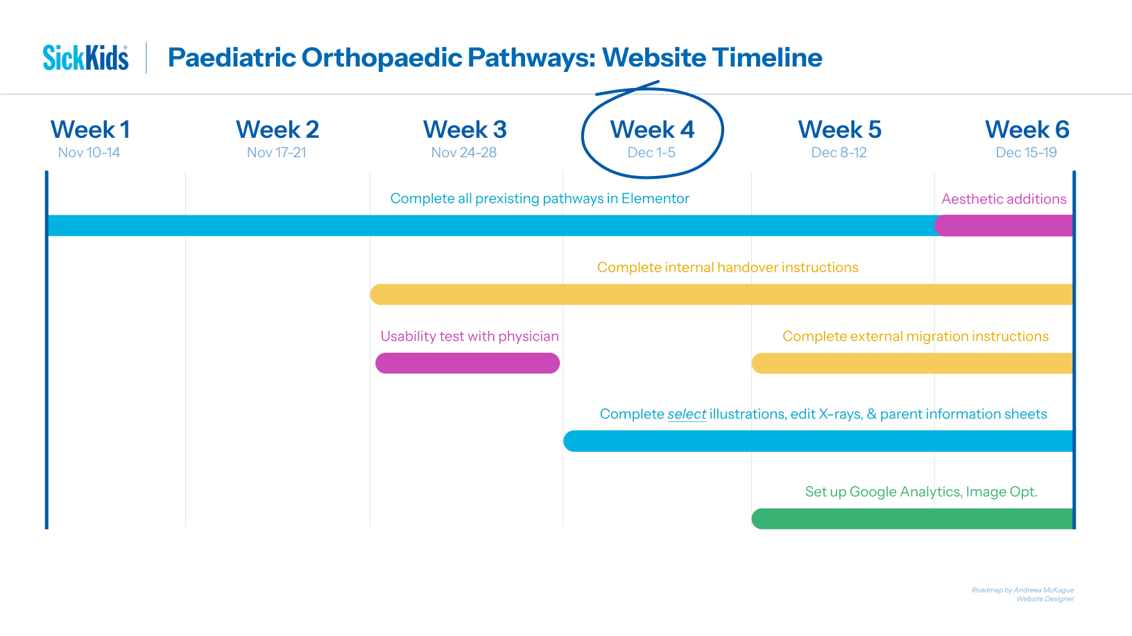
Applying an AGILE methodology, I created a month-by-month roadmap with key goals to take on this expansive project. Below is a high-level overview of my process:
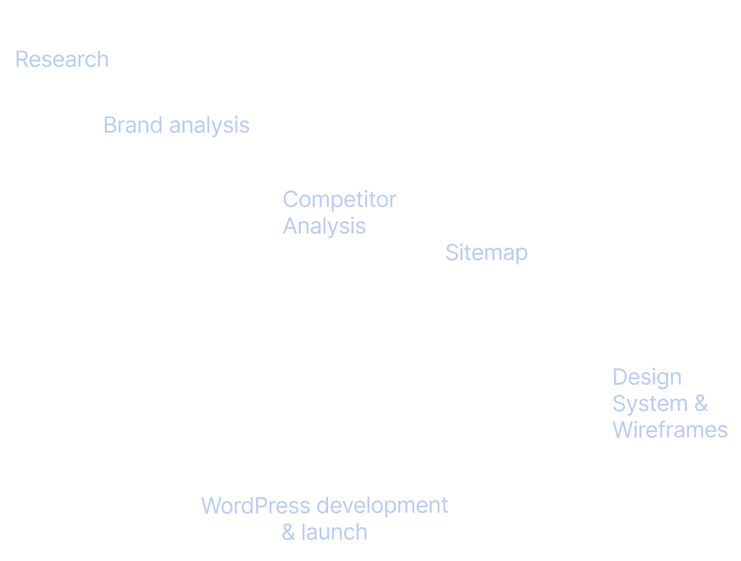
Month 1: Confirm Scope & Goals, Research, Brand
Analysis, Website Audit, Competitor Analysis
Month 2:
Sitemap, Design System, Wireframes
Month 3:
Usability Test, Refine Design System, Refine Wireframes, WordPress
Development
Month 4: WordPress Development,
Hand-Off Document, Website Maintenance Instruction Document
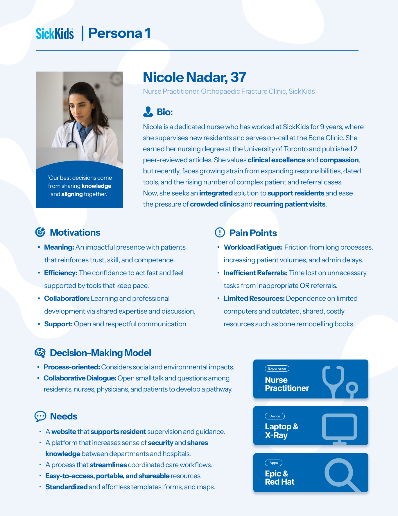
I shadowed and interviewed physicians and practionners then synthesized findings with secondary research from the National Institutes of health studies to develop three evidence-driven personas to guide user flows and translate into a list of design requirements.
One persona below outlines the need to design not only for impact but physician stress relief and streamline knowledge sharing:
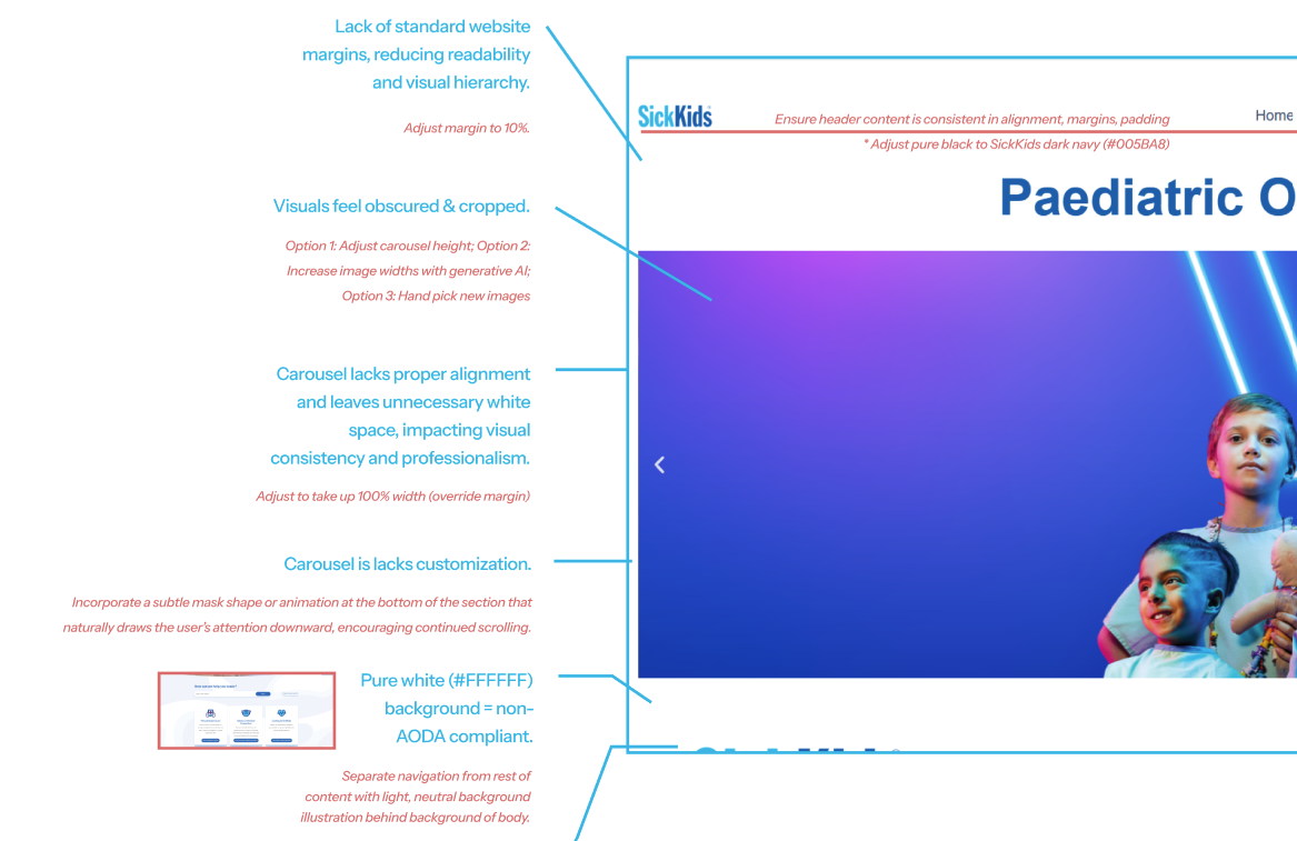
Before my involvement, the SickKids website was handled primarily by physicians, with only the main pages and content in place. There was little attention to design, navigation, or user experience.
I captured screenshots of the existing pages and conducted an analysis to identify opportunities for improvement.
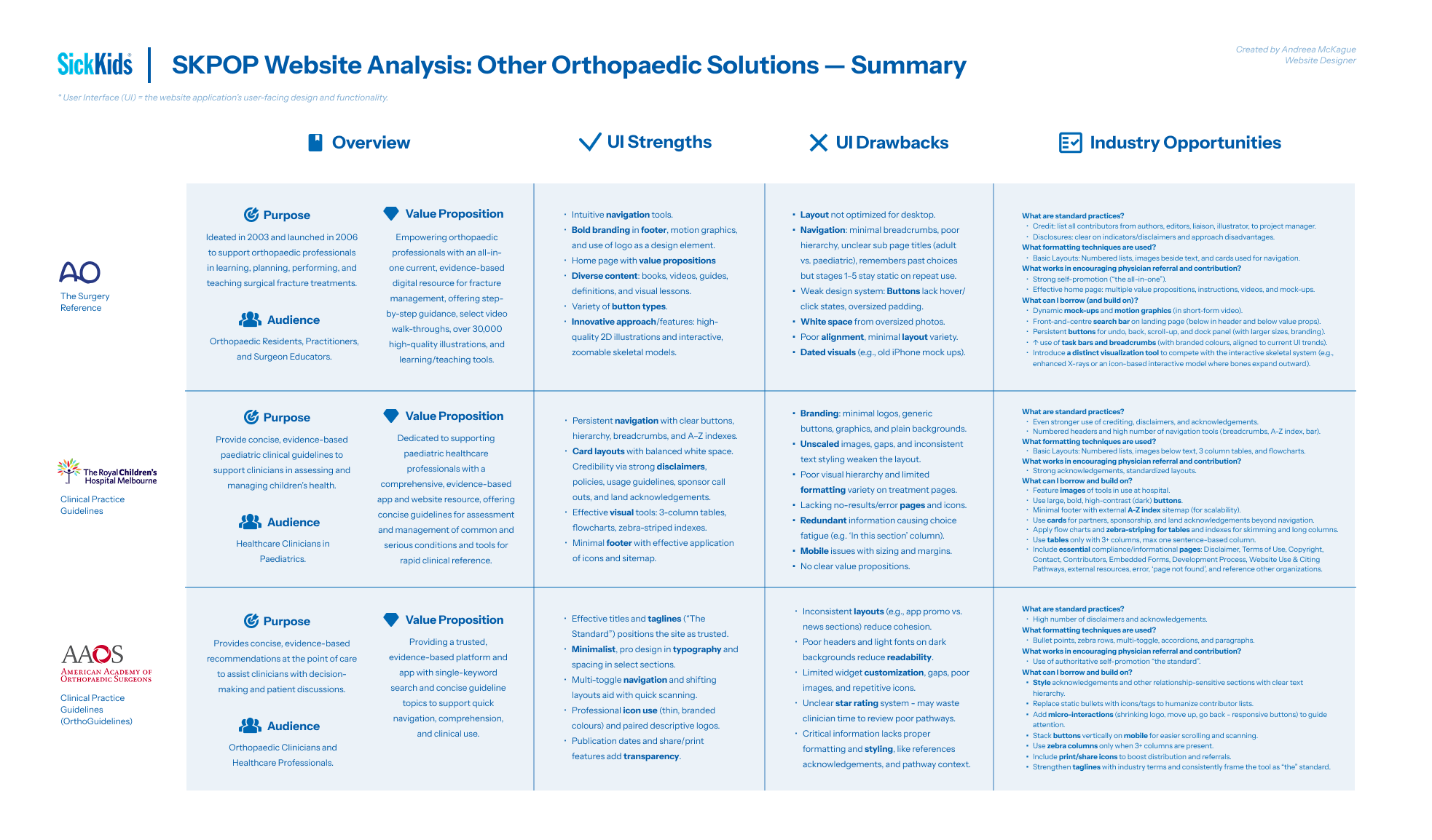
To inform my design decisions, I reviewed three comparable global solutions using the same screenshot analysis.
I consolidated these insights into a comparison document to identify best practices, design opportunities for improvement, and to ensure the final solution aligned with industry standards.
of physicians report that icons improve readability in text-heavy documents (OFID).
I identified an opportunity to simplify information and UI through small, consistent icons—reducing cognitive load.
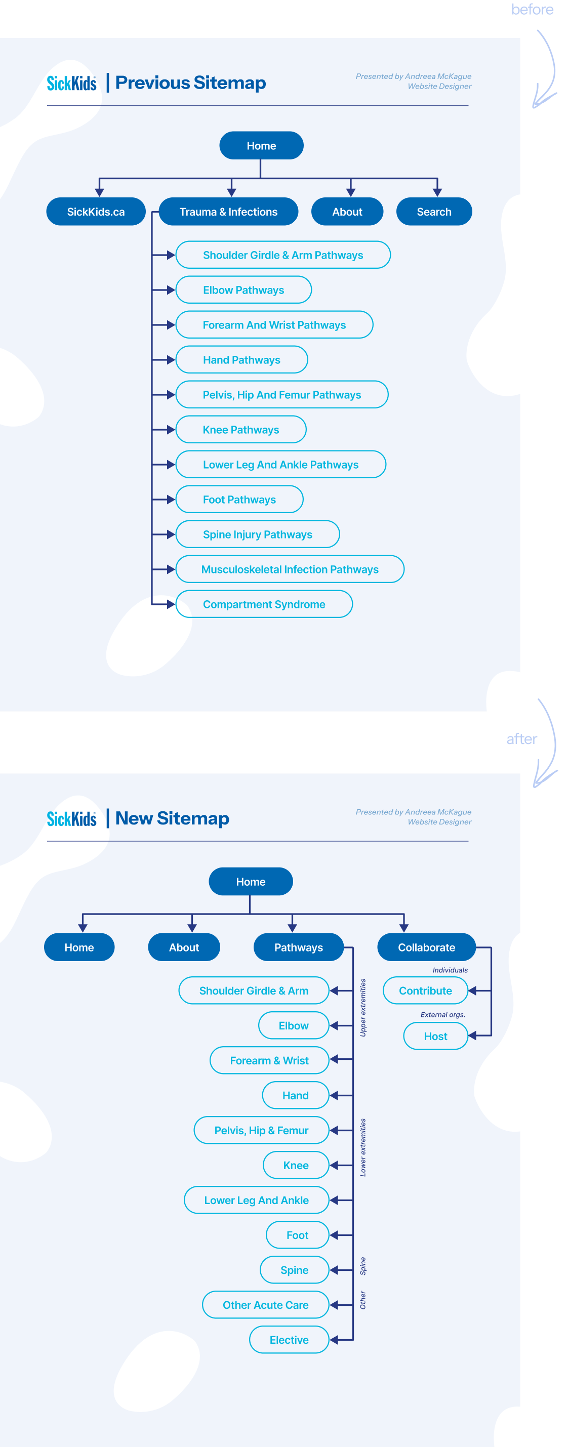
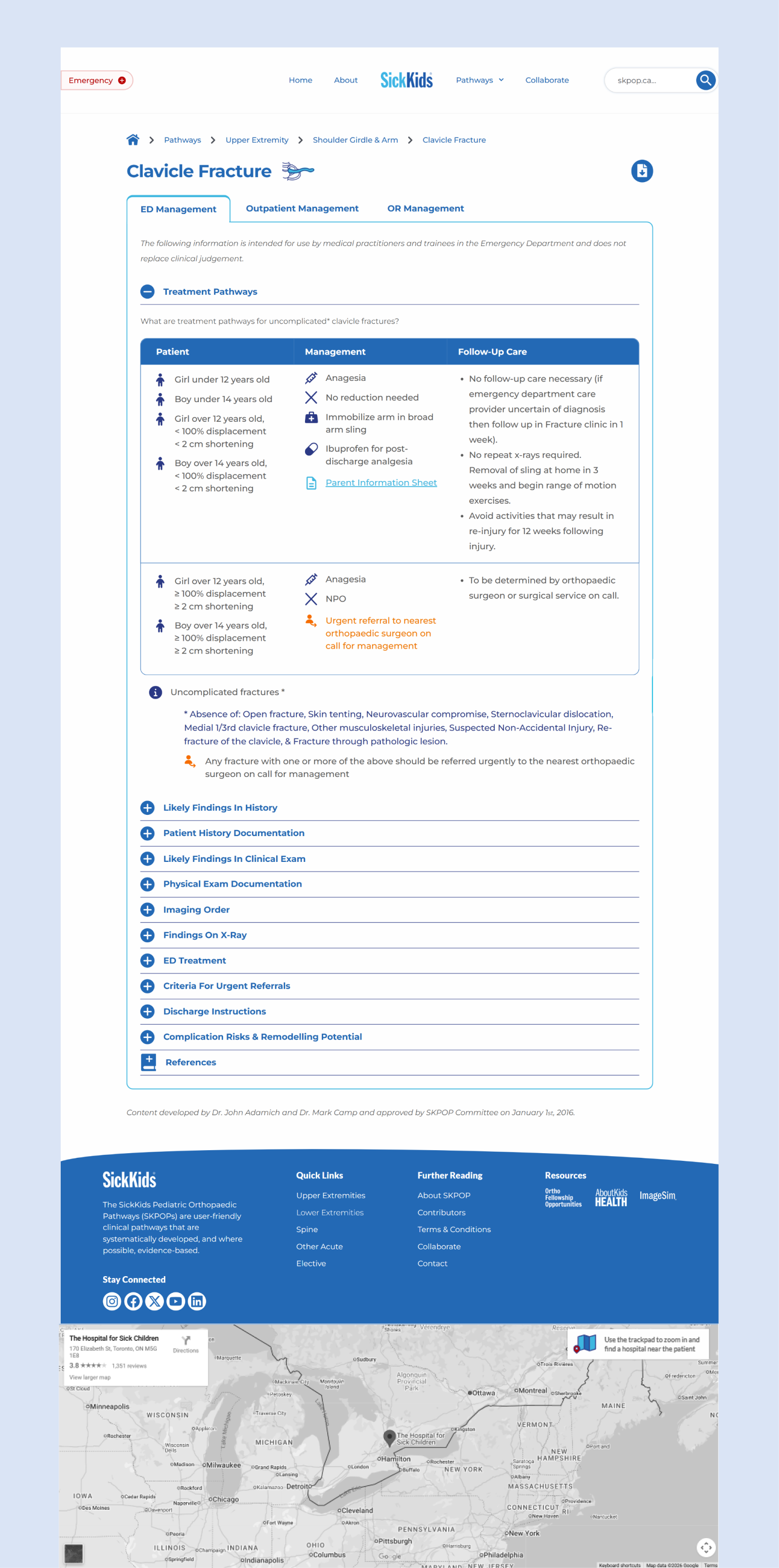
Guided by the user persona, analysis of the existing foundation site, and benchmarking of industry solutions, I created a new sitemap that prioritizes first-time users, streamlines navigation, and concludes with a clear call-to-action for collaboration opportunities.
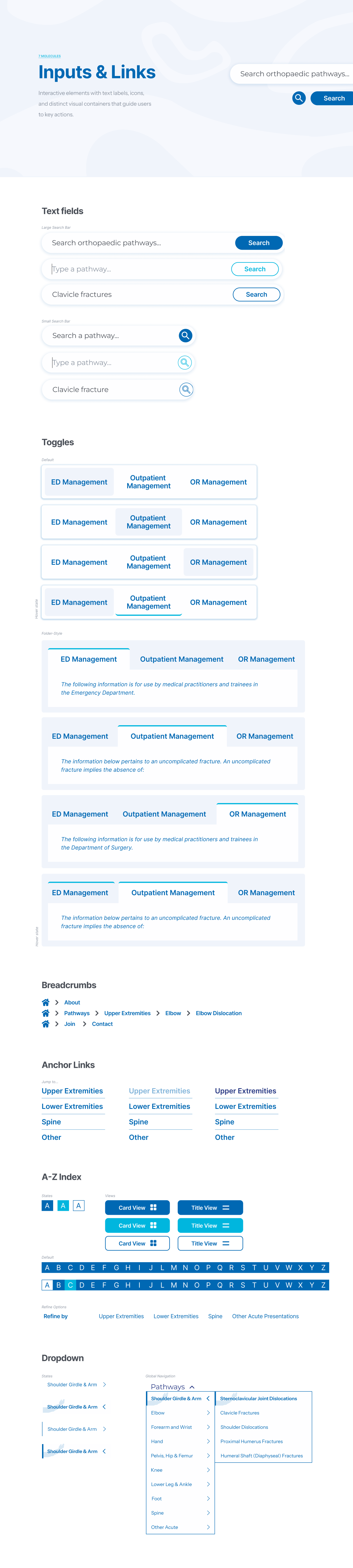
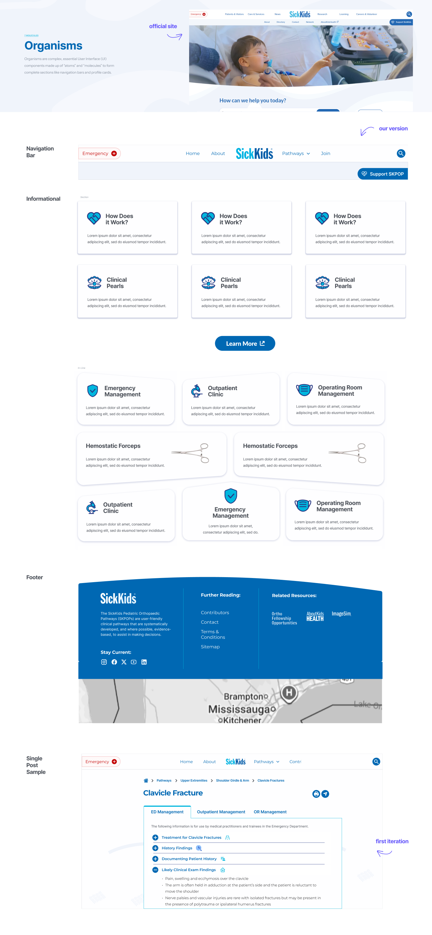
I created a comprehensive Figma design system, building on the official SickKids website while introducing original concepts. It covers atoms, molecules, and organisms—from adapting the global navigation bar to designing custom icons and a tab-driven structure for organizing content.
The input and link section of the design system:
Website development occured in WordPress' Elementor Pro. Elementor powers 10+ million websites globally, positioning it as WordPress’s leading no-code page builder. Through the development phase, I discovered that Elementor has known performance limitations with content-heavy website pages and deeply nested layouts. In month 3, during handover preparation and deeper content edits, editor load times increased despite applying recommended optimization strategies—indicating scalability concerns with the current layout.
I first investigated the performance issues independently through Elementor and WordPress documentation and developer forums. When improvements were limited, I escalated the issue to Elementor Pro support and confirmed that a structural workaround was required. I implemented optimization strategies to reduce editor load times and documented these workarounds in a handover guide, enabling future teams to maintain the current layout until future platform updates address the limitation.
In the final six weeks, creating individual resource pages took longer than anticipated due to information complexity, accessibility, and responsive design requirements. This signaled need for a revised approach to ensure all assigned pages were completed by the deadline.
I applied a timeline and capacity planning approach by revisiting
the original project roadmap, breaking the remaining work into
weekly milestones, and assessing my delivery pace. I aligned with my
supervisor to prioritize core responsibilities for my final month
and defer optional enhancements. This approach helped me audit
progress, improve efficiency, and keep the project on schedule while
producing standardized, on-brand work.
The timeline solution:
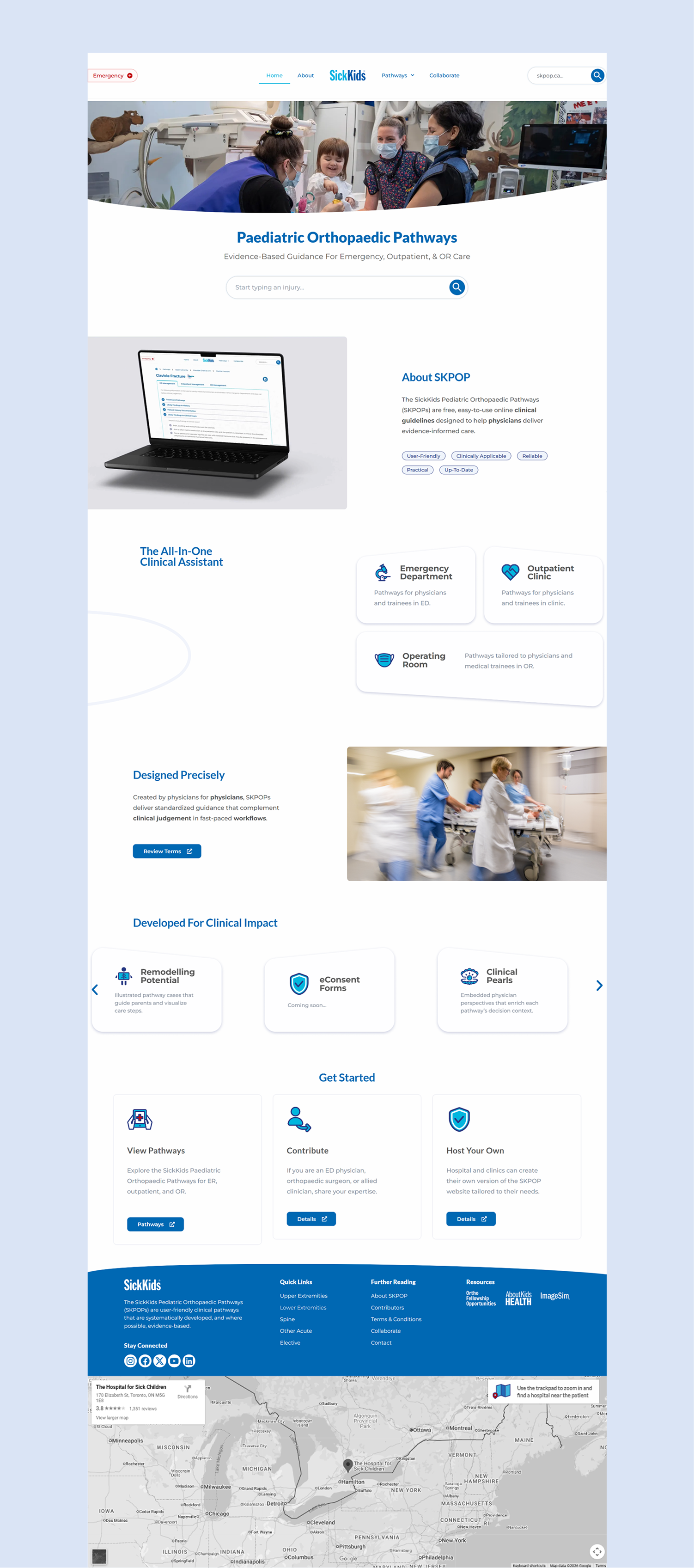
The final website is live and responsive, spanning 12 pages and 34 resource posts. It includes animated mockups, an icon kit, and place holder pages exist pending content development from the physician content developer team.
• Strategic Roadmapping: Developed month-to-month roadmaps and collaborated with my supervisor to balance ambitious design goals with feasible milestones. This ensured the project remained organized and adaptable as priorities shifted.
• Exhaustive Analysis & Research: Captured and annotated screenshots of the SickKids website, physician resources, and comparable sites. This allowed me to deeply understand the brand, identify industry website design best practices, and confidently make evidence-based design decisions.
• Human-Centered Service Design: Shadowed the Bone Clinic to observe workflows, interactions, and artifacts. I applied these insights, similarily to service design approaches, to create a website experience that were intuitive, aligned with physicians’ mental models, and supported their real-world tasks.
• Interactive Motion Design: Added sliders, header fade-ins, typewriter effects, and 3D mockups, enhancing the site’s interactivity and creating an immersive, engaging user journey that guided users naturally through content.
• Balancing Research and Exploration: I spent significant time on UX research and moodboard curation, which built confidence in design decisions—but it limited early-stage experimentation.
• Early Usability Testing: Planning tests earlier in the process could encourage a more exploratory approach, allowing iterative risk-taking rather than relying soley on hypothesis validation.
• Search Page Optimization: Spending more time analyzing search page UIs would allow me to design a more optimized navigation experience. Improvements in white space, typography, and navigation could enhance usability. Upgrading to a higher tier of Elementor Pro might also provide additional tools to optimize these elements.
• Strategic Marketing: Presenting the final concept within a comprehensive marketing strategy, such as a launch at an orthopedic conference, would enable thorough beta testing and invite feedback. This approach fosters closer collaboration with the academic and physician community.